.svg)


 6
6A landing page is the gateway to your content offer. It is the web page someone lands on after clicking a call-to-action on your blog, email newsletter, or website.
It has one job - to convert visitors to leads.
A strong landing page will provide you with the top of the funnel information about prospects that you need to kick-start your lead nurturing activities. A weak landing page means visitors will bounce, and your chance of a blossoming relationship dwindles.
The critical elements of a landing page are an attention-grabbing headline, copy to acquaint readers with the offer, a form to capture your visitor’s details, and of course a call-to-action ‘download’ or ‘click here’ button to get you the conversion.
Let’s not forget social sharing tools. You wouldn’t want to miss out an opportunity to reach a wider audience. And visuals will bring the offer to life. When creating a landing page for an eBook at Equinet, we usually include the front cover to show visitors exactly what they’ll get.
But these are just the key ingredients. Simply including them all doesn’t automatically make your landing page a recipe for success.
So if you’ve got these down, now we can get into how you can really make your landing page count.
Optimise your headline
Your landing page headline is one of the first things visitors will see, so it needs to pique their interest and encourage them to read on.
David Ogilvy said this about headlines: “On average, five times as many people read the headline as read the body copy. When you have written your headline, you have spent eighty cents out of your dollar.”
The reality is your headline can make or break your landing page.
So, make it:
- Specific - cut to the chase and be clear about what you are offering
- Compelling - use strong verbs and adjectives to engage readers
- Value-centric - tell the visitor right away how they can benefit
- Bold - it should stand out on the page right away
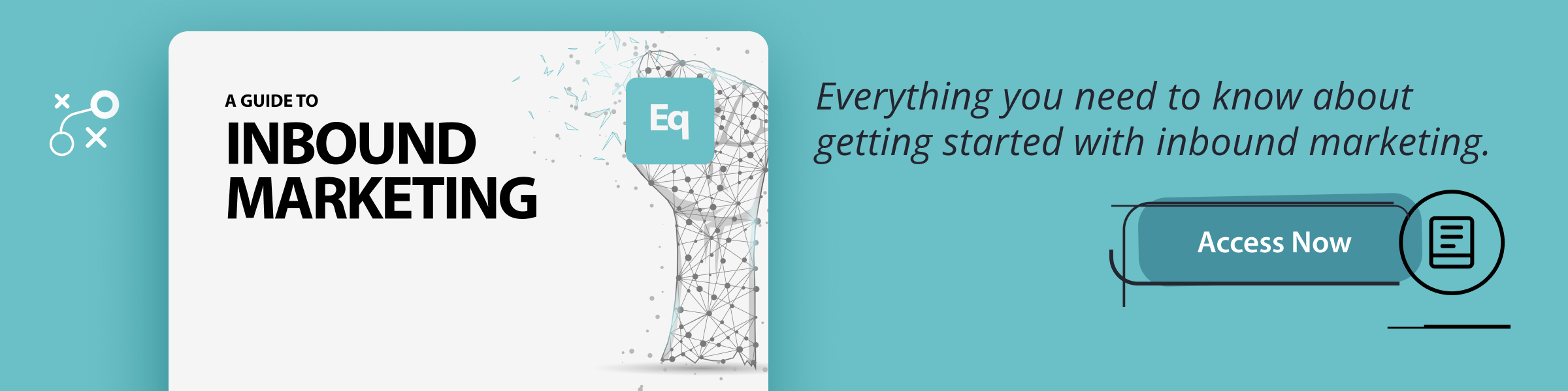
Let’s take one of our own landing page headlines as an example:
The offer is clear - it’s a guide to implementing inbound marketing. ‘Explore’ and ‘discover’ are strong verbs that make it compelling. The value is emphasised - “discover the ‘why’ and ‘how’”. And the bold text draws the readers attention.
Be succinct with your copy
Visitors need to know exactly what they’ll get when they hit the button to download your content. So your copy needs to clearly convey what the content is about.
But, it needs to do this quickly or you risk losing their interest. So keep your copy short, sweet and easy to digest.
Sum up what the content is about in just one or two sentences. Then follow up with how the reader can benefit from your offer - emphasising value is key.
As with any copy on your website, there are easy ways to break it down for readers.
Use bolding to draw readers to key words and messages. Use bullet points to detail what they’ll find inside the offer. If it’s an eBook, it’s a good idea to include a bullet point list of each of the sections it covers.
While it may be tempting to spill all the beans of the content you’ve spent all that time carefully crafting, don’t give away all your secrets and risk losing your chance to convert.
Keep it minimal
Minimalism might be the latest trend, but it’s been working for landing pages for years.
Many people find it difficult to focus on their work when noisy colleagues or a messy desk are causing distractions. The same can be said for viewing landing pages. Too much on the page can be distracting, even overwhelming, and visitors will struggle to focus on your offer. The risk is they’ll abandon the page before converting.
A page that's too busy may even put them off your company altogether. And as this may be their first interaction with you, you want to make a good impression.
White space (empty space) is your friend when creating landing pages, just like it is for blog posts. It will improve your visitors' focus and lead to greater comprehension of the offer. So they'll be more easily convinced to convert.
Removing your website’s main navigation bar from the landing page is another way to limit distractions.
Of course, your website needs a clearly visible main navigation bar to encourage people to click on different pages to further explore your company and products. But it’s the opposite for landing pages. You don’t want them moving away before even converting! So the simple solution is to remove any temptation for your visitors to wander.
Seal the deal
The most important element on your landing page is a simple form that prospects complete in return for access to your content offer.
Getting a visitor to part with their details is the final hurdle - a vital one.
One sure way to put them off is to ask so many questions that they decide it’s just not worth their time. Or worse still, they conclude that you’re hard work and are put off your company entirely.
You want to encourage, not dissuade, people to fill out their details, right? So while this may feel like a great opportunity to ask them everything you could possibly want to know about them, don’t overburden them and risk losing your opportunity to convert.
HubSpot suggests the following factors contribute to whether a landing page visitor will complete the form:
- The value of the offer to be redeemed (Is it valuable enough to the visitor to be worth the form completion?)
- The types of information requested on the form (Does the form ask for too-sensitive information that dissuades visitors from completing the form?)
- Website credibility and visitors' perceived sense of privacy/security (Does the visitor trust the website enough to feel secure in providing their personal information?)
Clever styling of your form can also give the illusion that it’s shorter than it actually is. You could reduce the space between fields or position the titles of each field to the left rather than above.
Be sure to include your privacy policy at the end of your form. People want to know their details will be kept confidential and not shared with third parties.
Finally, make sure the button at the end of the form stands out. Make it bold and colourful so it’s easily recognisable as a button. Use strong language that conveys a sense of urgency, like “Download your eBook now” or “Get your free eBook now”.
A strong landing page is the heart of successful inbound marketing. You may have a great offer, but without an effective landing page, your goal to convert visitors to leads will suffer.
The tips above provide you with some guidance for creating better landing pages. Start by taking one of your landing pages and adapting one element, like the headline, and see whether it makes a difference to your conversion rates. With a little trial and error, you can find out what works best for your business.