


 6
6Many bloggers and content creators will just take or find an image and use it "as is" - but this is rarely the best approach. Ideally, they should be resizing it, adjusting the contrast and brightness, sharpening where necessary and cropping.
The first three are fairly obvious: uploading a huge image and letting the blogging software resize it slows down response times and is unnecessary; adjusting contrast and brightness will get the best out of the image and show all the detail; whereas sharpening will also help the detail and remove any fuzziness.
But why crop? Of course, if you have a rigid layout with a specific area for an image, then you would have to resize and crop to fit that space. But otherwise? Well, cropping is a very powerful tool in the content creator’s toolbox - which is mostly overlooked - but once you understand its power, you will never look at images in quite the same way again.
1. Cropping unwanted content and focussing on the message
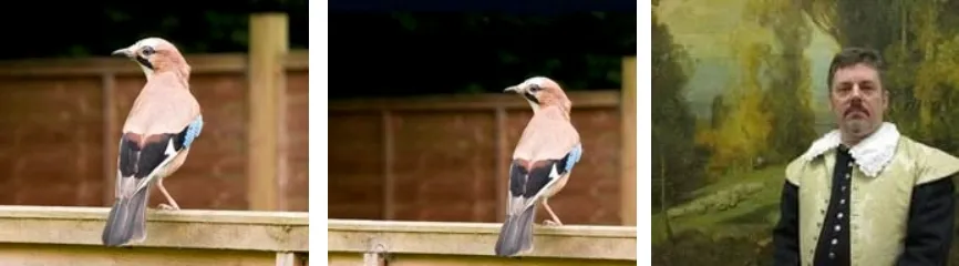
The first and most obvious reason to crop an image is to remove any unwanted background in the original. There may be an untidy background, details you don’t want to be seen, or people you don’t want in the picture. Perhaps the subject’s hands are awkward or they are standing strangely – cropping in to the body or head and shoulders may be the solution. The fancy gold frame is a bit of a distraction in the first portrait, below, and the fact that it's incomplete jars the eye. In the second image it's been cropped out, resulting in a cleaner image that emphasises the subject more.
.webp)
But you can look at this another way: can you place more emphasis on the item(s) you really want to feature by cropping the image? Cropping right down to focus on the one element that’s important often gives it more impact; often makes the point more forcefully.
Remember that each image should be telling one story, making one point, getting a single message across. Trying to get several messages across in one image just leads to confusion in the viewer’s mind. And always bear in mind the message of the image should back-up, or compliment the message in the accompanying text.
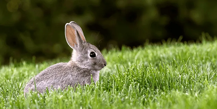
2. Cropping for composition
There is a helpful law covering the composition of a picture called the Rule of Thirds – split your image up into a 3x3 grid, align major features along the grid lines and crop accordingly. The image of the bird, on the left above, is fairly boring and doesn't add any style or excitement to the page. Whereas the image on the right - composed and cropped according to the rule of thirds - is more interesting and stylish, and adds more dynamism to the page.
With portraits, it’s the eyes that should be lined up with the grid lines. Using the Rule of Thirds will result in a more interesting image - and the eye naturally finds such a composition more pleasing. If you use Photoshop to edit your images you will find that the cropping tool can actually display the 3x3 grid when cropping to help you.

3. Cropping for impact
.jpg) Using an unusual crop can give an image a greater impact - for example, a thin vertical strip or a long horizontal rectangle.
Using an unusual crop can give an image a greater impact - for example, a thin vertical strip or a long horizontal rectangle.
This is best used in the middle of a block of copy, breaking it up and creating visual interest.
It's best to run copy around a vertical image and use a long horizontal image to break up sections (see the car in the desert image below).
Cropping to a square format suggests stability and formality.
4. Unusual shapes

This one is both powerful and dangerous, as it can end up looking a bit weird or gimmicky. But cropping an image into a simple circle can bring impact to a page.
Using rounded corners is another fairly safe option. But using anything too "wacky", like stars or diamonds, interrupts the viewer - whose immediate reaction is: "Why is it like that?" Once they start thinking about your design choices, you’ve lost their attention on your message.
If you have multiple images on a page it can be best to treat them all the same way (unless there is an obvious reason why not - a writer’s bio picture in a circle for instance when all other pictures are rectangles) - otherwise it either looks like a mistake, or the viewer will start trying to read meaning into the differences; and again you've lost their attention on your message.
I once received a leaflet where some of the pictures had opposite corners rounded off. Now, I have no idea why it was only on some of the pictures, and not others, but I spent a long time wondering if there was any significance to it. In the end I couldn't find any. And that is all I can remember about that leaflet – I couldn’t tell you what the leaflet was actually about, what it was selling, or who it was from.
5. Cropping for emotion
.jpg)
Suppose you have a figure standing alone on a beach: if you show all the beach in a wide image with the person to one side, it emphasises the isolation of that person. If you crop it right down to the person, then you lose all that. The image above emphasises the barrenness of the desert by using a wide crop and placing the car on the far left. Cropping in to the car would completely lose that isolated feeling.
As a general rule, the closer you crop to the face the more personal the image becomes. A full figure shot with background is formal, professional, somewhat distant, a head and shoulders is friendlier, more intimate.
Cropping the top and bottom of the head can look modern and confrontational, depending on whether the person is side on or facing the camera. If you have to feature portraits of business people in your blog, they can often look boring or uninteresting. Experiment with different crops to add variety and dynamism to the photos.

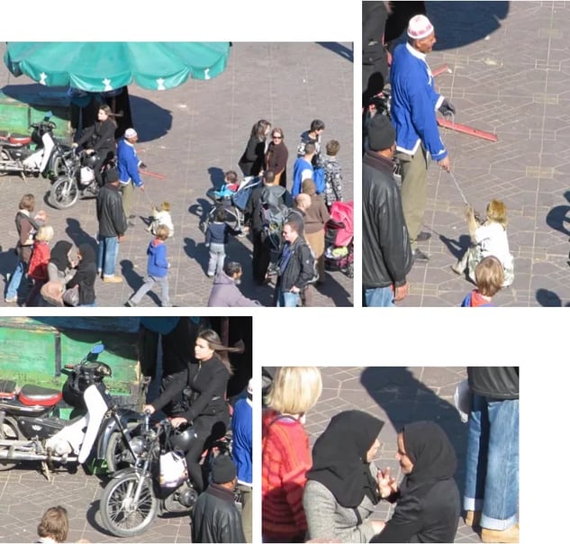
6. Cropping for a story or context
Sometimes cropping the image can completely loading="lazy" alter the meaning of the image. Always be aware of the story the image is telling – will cropping it change the story? Will it help to concentrate the meaning? Will cropping remove the context and perhaps even render the image pointless? The main image of Marrakech market (left, below) has a number of things going on and might be ideal if you were trying to convey the everyday chaos of the busy souks, but cropping it in different ways totally loading="lazy" alters the story told. You have a man with a chained monkey which will most likely provoke an emotional reaction; the young, modern woman on a motor scooter; or two ladies chatting. Each tells a different story - each is just a crop from the original image.
Whatever you do with your images, always try to crop in a way that is sympathetic to the message of the post.
So, whenever you are tempted to take a picture from whatever source and just upload it to your blog and use it as it is, stop. Think about how it might be cropped to complement the message, to emphasise a point and to add interest to your post. Cropping is a very powerful creative tool – one that every content creator should keep handy in their toolbox.
