


 10
10According to visual content marketing statistics shared by HubSpot, 32% of marketers say visual images are the most important form of content for their business, with blogging tailing behind in second (27%). When images play second fiddle to copy you have a recipe for disaster.
Scrimping on your image curation efforts degrades your content, and leads you to miss out on the opportunity to attract more readers and convert website visitors to credible leads. It has been stated that articles with images get 94% more total views than articles without images.
Experiment with image description
As a writer, you sure know how to use your words. You have no trouble illustrating a point - so use this to your advantage.
Let's break a typical image search process down:
- Start with a list of descriptive words, metaphors or scenarios related to your blog topic.
- Step away and ask, what are these also reminders of? What other things could you apply them to?
- Consider more abstract, general themes - colour, symbolism, literary/historical/social references.
- Apply advanced search filters.
- Get inspired! Pick a photo you like the style of and browse the artist’s library, as well as suggested similar images.
- Read the descriptions of images you like and borrow the descriptions for your search queries.
- Find a composition that could work for you, and test out how it would crop.
Usually, I have a look for an image half way through the writing process. I find that seeing it in place helps shape the rest of my writing. It dictates the tone, and gives some clarity about the direction of the piece.
Regarding search text, less is more. Image descriptions that are short and open-ended tend to pull up better results.
"Traveller on cliff" will bring up more results than "Life on the edge man on top of cliff mountains enjoying view mountain landscape travel globetrotter lifestyle success motivation concept breathtaking adventure active vacations outdoors". All of these words are useful prompts, but they should be broken up into separate queries.

Visualise the final dimensions
This should be image selection 101, but it’s actually the most common error I see. When you’re scrolling through a library of gorgeous images, it can be easy to get seduced by a concept or individual image.
But if an image doesn't suit your final display dimensions, my advise would be to bookmark it for a rainy day. Perhaps it could be used within the content body instead, to break up text. During your image search, it’s important to understand the image dimensions you are working with and visualise the final crop size - especially if it's radically different to the source image.
For optimisation purposes in HubSpot, webpage banners are often pulled directly from the featured image. This means that the image you settle on must suit two very different dimensions. Using a logo, icon or other isolated image rarely works.
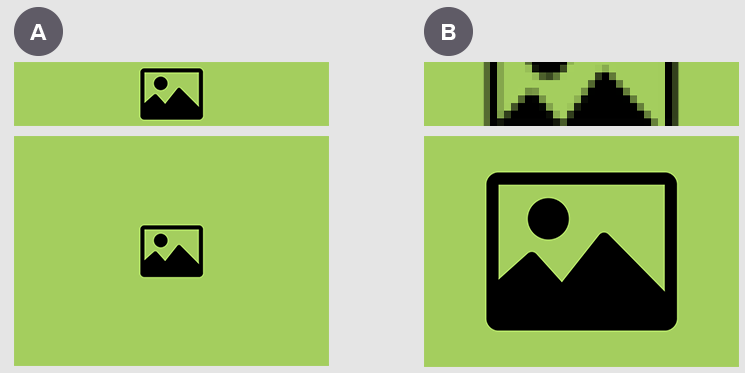
Let's compare banners against featured images. Minimising the central icon in an attempt to fit it inside the banner space (A) makes the featured image look unbalanced: there's too much space around the image, and the focal point itself is tiny. This strains the eye. Conversely, if you enlarge the icon to fill the feature image, it becomes stretched in the banner, blurs the picture, and cuts it off awkwardly (B).
Responsive design requires that you optimise your images for use across multiple displays. Finding an image that celebrates a horizontal line of focus, can be cropped without losing context, and uses landscape orientation works best.
Retain image quality
Bear in mind the limitations of the image format you are working with.
When it comes to JPEGs & PNGs, a small pixel image (< 500 pixels) cannot be stretched to standard HD (1920 x 1080) without quality loss. To scale endlessly without reducing quality, you would need to use a scalable vector graphic (.svg).

There can be flexibility when it comes to composition, but this is image dependant. Editing techniques can be used to manipulate some images to make them more suitable. If there is a very plain background, for example, it is easy to extend the empty space and fake a bigger backdrop.
Masking layers, shadows and vignette effects can be applied to boundaries to expand your canvas - but in my opinion, there’s a tendency for this to look a little bodged. A nudge here or there is perfectly acceptable, but once you start chopping and changing the entire image composition, it is thrown off-kilter and your image selection strategy becomes questionable. This is especially true when working with photography, where composition has much to do with why the image looked good in the first place.

Hand pictures are a good example of the way cropping can drastically change an image. Typist hands are used quite frequently in B2B marketing. They are an easy way to represent industrious activity, are fairly neutral and have a serious vibe. For corporate content they're an easy win.
However, squished inside the dimensions of a narrow rectangle, the image becomes hard to interpret. Now all you can see is a sea of fingers. It doesn’t communicate a theme, and it’s neither interesting nor relatable. Perhaps there's a better way.
Changing interpretations require you to weigh up editing against the unique value of the original image - and how its thumbnail will be affected. Are you editing the image because it’s so special it can’t be replaced?
If not, it might make more sense to replace your image selection. Keep your buyer personas, and their perception of an image, at the forefront of your mind.
Find multiple crop opportunities
Keeping an eye out for images that can be cropped in multiple ways is a useful habit to develop. The image accompanying your blog may be used in thumbnails, banners, copy body, newsletter preview, social media etc.
So, does it look good in all sizes?
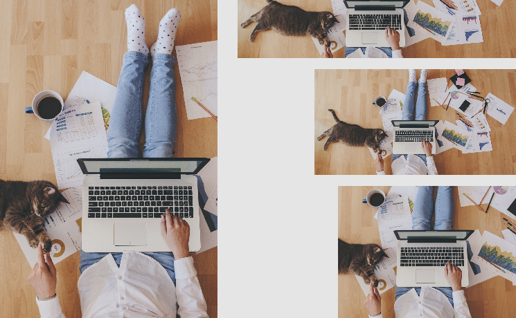
The above image of somebody working from home is a great example of a highly flexible image. As you can see, it crops easily for many different B2B marketing purposes. The vertical one could be used on a CTA, and we also have a page banner, LinkedIn/FB social share size and a newsletter image ready to go here.
This opens up opportunities for you to promote your blog using visual marketing - which vastly increases reach. On social for example, tweets with images receive 150% more retweets than tweets without images. Facebook posts with images see 2.3X more engagement than those without images.
Here, resizing scope is possible for a number of reasons:
- There’s a fairly even distribution of visual interest. You have the cat, the typing action and the spread of work material littered across the photo.
- It has fairly neutral space towards the edges - there’s a sense of things getting less important as they move out from the centre. This gives it breathing space. It would be easy to subtly extend the boundaries of this image than say a crowded, patterned piece.
- The most interesting things in the picture take place along a level horizon line. This makes it a good candidate for a banner image.
- There is height variance. The person (a focal point) extends across the image from top to bottom, giving strong potential for a vertical crop.
If you struggle to picture how a crop might look, use the Shutterstock editor. This allows you to preview different crop sizes before committing to a download. You can even save presets, which makes it easier to compare a variety of sizes.
Reinforce blog context
Ask yourself - if you couldn’t read the title, but knew the company and their area of expertise, could you guess the general tone or direction of the blog? Could you guess the topic cluster? For Equinet, I believe you can generally differentiate between the blogs focussed on video and those aimed at content writing, based on image alone.

It's not a rule set in stone. First and foremost, images should inspire emotion and attract interest. It helps if the tone of your image supports the tone of your copy. That doesn’t always come from an entirely straight-forward process.
By picking up on something specific you wrote, or reflecting on the topic as a whole you can maintain a strong connection to the copy. Think of image selection like holding up a mirror. People recall images easier than text, so it's important your image resonates with your reader for the right (relevant!) reasons.
Sometimes it's helpful for readers to be able to see a theme running through all of the images relevant to a certain topic. This can be done through image selection - or perhaps you could create a theme using image treatments instead, applying a topic-specific colour wash for example.
HubSpot encourages writers to add images that convey an emotion that reflects what your audience is likely to be feeling when they come across (or leave) your page.
Think about the mood of your piece and how are you trying to affect the reader. What are the implicit and explicit meanings of the image you have chosen? A strong image choice should reinforce blog context.
Use advanced search options
Use the search filters available on image libraries to your advantage. You can narrow your search by specifying landscape or portrait orientations, choosing dominant colours, and even content (photography, illustration, people, abstract).
Applying too many filters at once restricts results. However, strategically using one or two when you are overwhelmed by choice can save you valuable time.
Be wary of trends
Don’t get too attached to the romantic idea of an image - you have to be prepared to let go of a concept that doesn’t work in practice.
For example, say you are writing about expanding your business. You might think of plants, symbolically. They represent growth and development, and the fruits of effort. Sounds good! Trouble is, too many others have followed the same train of thought.
If you search for the specific picture you have in mind and the first couple of pages are chock-a-block with similar images (none of which are all that spectacular) chances are you’ve hit upon a cliché.
Trust your gut. If you are bored of seeing a certain theme or style, don’t use it. Why would it interest others? Also, be aware that heavily stylised images have a tendency to age quickly - taking potentially evergreen pieces of content and stamping them with an expiry date. Sometimes it can be better to err on the side of caution. This is totally subjective, and your call to make.
Use persuasive colour
Consider the use of brand colours on your site. Is your chosen image complimentary, or does it jar with your design?
Although I love black and white aesthetics, and a lot of my own artwork is monochrome, I tend to avoid this look when choosing blog images. Colourful design simply performs better when it comes to click-through rates. Consider how your use of colour affects meaning. Much has been written about the psychology of colour and how the colours you choose for web design can have a subtle effect on people’s actions. Striking the right balance between staying on brand and making content stand out can be tricky. Having an awareness of colour theory can help you make more strategic decisions.
So there you have it, those are my main tips for sourcing blog images that elevate your B2B content.
If you still get truly stuck, why not do some competitor research? You could have a browse to see what other images are associated with your topic cluster. Or, if you work with a media agency, you can always reach out for assistance.
If you have more questions about image selection best practices, read 'How to find powerful images for your B2B marketing blog' to get more info about image composition, the golden ratio and finding the WOW factor.
There are no hard and fast rules to image curation. However, bearing some of these points in mind might help you filter out the duds and ease your path to finding perfect images for your blog.

