


 5
5We know that blog posts without images are not nearly as attractive as those with images and will suffer a lack of readership as a result. Very few bloggers have the time, resources and skills to go out and either shoot or commission original photography for every blog post they write. So stock photography is a necessary evil that almost every blogger will resort to at some point in time.Why do I say necessary evil? Well, as bloggers, we’ve all seen stock images in blogs, and most of us will have used them at some point or another, some of us maybe every day. But we have all seen images that look uncomfortable next to the associated content or are just too obvious. Poorly chosen, or poorly used stock photography, just seems cheesy or glib. At its worst, it can stop the reader in their tracks or fight the central message of the post.
Some stock images are just downright weird or inappropriate for almost any purpose. And earlier this year, to promote the movie Unfinished Business, a set of deliberately cheesy images were created, which photoshopped the lead actors into existing stock images.
So given that most bloggers have to use stock photography at some point, here are a few quick pointers to ensure that you get the best out of using stock images.
1. Don't just pick any old image
 The key reason an image feels uncomfortable is that it fights with the written content. Every image has a message, and if that message is different to, or conflicts with, the messages in the text, then the viewer will get confused. And you will fail to get your point across.
Likewise, picking something that is too abstract is also an issue, as the reader will be wondering what connects the image with the text - rather than reading, and paying attention to, your post.
In these instances, you are better off with no image at all. Pick your stock images very carefully - it's crucial.
This may take some time and a lot of browsing!
2. Do make sure the image is on message
 Look at the picture - what is the obvious message the image suggests? Does that message help emphasise the point you are trying to make? Does it compliment it or highlight another aspect of the message?
Check for any secondary messages in the image that might conflict with your point. Try and pick a picture that tells one simple and obvious story.
3. Don't get the tone wrong
 Some stock images are serious, some light-hearted or jokey, some dramatic, and some a bit wishy-washy. Make sure the tone is appropriate to that of your article.
It would be wrong to use a jokey cartoon with a serious blog from the chairman of an organisation, for example.
And some images can powerfully evoke a particular mood. Dark stormy pictures, for instance, suggest trouble or drama, which is great if that’s what you are going for. But they may not be appropriate for an article about the latest financial results!
4. Do use humour to attract
 A humorous stock image can be used to lighten the mood - putting a smile on someone's face makes them more relaxed and more receptive to your message. In this respect images are usually better than cartoons - cartoons feel less professional and have to be funny to work well.
On the other hand, humour is very subjective, and what one person will find funny, another may find offensive. It is always better to err on the side of mildly amusing, rather than go with something that might potentially offend.
With humour, thinking about all the different readers of your blog and how they might react is crucial. And remember, although humorous images are very powerful, they are also very difficult to get right and to judge their appropriateness, so if you are in any doubt - leave them out.
5. Don’t forget to pay
Good stock photography is rarely free and is often connected to a usage agreement and a fee. Always check what the usage rights are and pay the appropriate fee. Being taken to court for non-payment of usage fees won't do you, or your organisation any favours. There are lots of sources of free images out there - but often you get what you pay for.
6. Do get creative in the use of your image
I've written elsewhere about cropping and different ways to use images, so do think about how you might use a stock image. In particular, cropping can change a relatively straightforward image dramatically - giving it more impact and getting away from the stock image look. Don't forget you can always use different bits of the picture in your posts. You could change the image by colouring it, cutting out elements, vignetting, and other effects - but make sure to check your usage agreement allows this.
7. Do add text and branding to an image
 One way to get away from that stock photography look is to add a message and/or branding to a picture. Simply by adding a headline, inset panel or branding to an image it makes it "your own". Most readers find it easy to spot a stock image a mile off. And while there is nothing particularly wrong with being caught using stock images, it never gives as good an impression as creating all the images just for your blog post.
Adding a message and/or branding also has some other compelling benefits. Firstly, when the picture is shared on its own - on social media like Pinterest, Facebook or Twitter - it will not lose its context, and every share will help spread the message. Secondly, if you can create a humorous headline then more people will share the image - it may even become a meme if you are very lucky. (But do bear in mind my comments above on the subjectivity and difficulty of doing this).
Using stock images needn’t result in a visual cliché or a cheesy feel - if you follow these simple guidelines. And remember, the most obvious tell-tale sign you’ve used a stock image is it looks awkward with the content - conveying a message of its own that is different or even counter to that of the post.
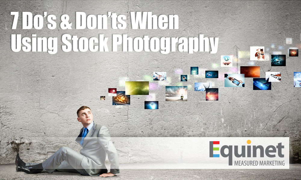
(All images in this post are stock images from Shutterstock)
Incidentally, I've deliberately added an apostrophe to "Do's" in the headline - but we could have a long discussion about it...

