


 7
7'Call-to-action’ (CTA) describes a website element that is designed to promote an offer and guide visitors toward it. Typically, they come in the shape of a button, image or textual hyperlink. CTAs are a powerful marketing tool that help to increase awareness and invite meaningful engagement from potential - or existing - customers. They can be thought of as a directional cue that shows interested parties where to head next.
Is it easy to access all of the resources on your site? Perhaps your website has such a wealth of information that it’s unclear where to start. Guiding visitors towards the site content that would be most helpful for them at their stage in the buyer’s journey is one of the best ways to optimise lead conversion paths.
Here are some examples of CTA goals based on inbound stages:
Awareness stage - subscribe, browse content. Introduce visitors to your collection of resources and encourage them to explore.
Consideration stage - download content (ebooks, whitepapers, checklists, data sheets, or case studies). Help prospects give name to their pain points and illuminate methods or strategies that could be used to solve a problems like theirs.
Decision stage - product demos, free trials, screencasts, FAQs, contact us or request consultation. Encourage leads to become customers.
Marketers also use CTAs to gather information on the performance of marketing content. You can monitor click-rates to get an insight of user interest. This can help inform future strategy.
How to create a CTA in HubSpot: the basics
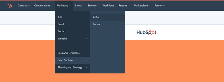
Log in to your HubSpot portal, look to the top navigation bar and select Marketing > Lead Capture > CTAs. This will take you to your CTA library. This is where you can view or edit CTAs, analyse performance and create new examples.
On the 'Calls-to-action' page, you can either clone an existing CTA (Actions > Clone) and edit parts of that, or start from scratch (Create new). Let's imagine you clicked the create new button. A side window should appear, showing you three levels (design, options, finish). The design level is where you will control the appearance of your CTA. You can choose to make a simple custom button, or an image button.
Design
If you make a custom button, you can choose from a small selection of template styles (simple, padded, pill etc.), dictate button colour using a HEX code, write CTA micro-copy, change font elements and attach custom CSS.
The image CTA section allow you to upload an image and control the width/height. HubSpot also gives you the opportunity to input some optimised image alt-text. This helps search engines to categorise your images and understand their context, which may boost your website rank.
Options
The options section deals with inbound marketing housekeeping. This is where you can change the internal name of your CTA, amongst other things.
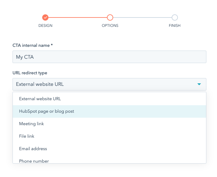
Choosing the right URL redirect type in CTA options.
Don't forget to choose an URL redirect type from this dropdown list. If you are linking away from your site, select External website URL as your redirect type. However, if you're linking to one of your own site pages or files, you really should indicate this by choosing the appropriate label. It's important to label redirects accurately, as they will affect how they are counted and recorded in your lead capture metrics.
Hitting Test Url will open up the CTA's link in a new tab or window, allowing you to check you have put the right one in.
If you like, you can instruct the CTA to open the link in a new window, with a simple box-tick, although inbound strategies tend to discourage this, as you want to guide the visitor forward and remove distraction.
Lastly, you can assign a HubSpot campaign to your CTA. this will help you collect data about your CTA's performance in the wider context of your marketing campaign.
Finish
Press save to finish your CTA. It's now ready to insert on website pages and blogs! You can return and edit CTAs at any time (Actions > Edit).
It's also possible to set up A/B testing to compare different styles against each other (Actions > Create multivariate test), and optimise them for mobile and other display sizes (Actions > Create smart version).

How to approach CTA design
When designing your CTA, there are 3 essential things to consider: visuals, copy, and placement on site.
Visuals
Colour is the most important visual aspect of your CTA. The optimal choice of colour will depend on your brand, but shades of green, red and orange are said to work well. Try to find a colour that ties in with your overall colour palette without blending in too much. Vibrant colours attract the eye whereas black, grey and brown buttons don’t tend to spark much interest.
It is important that the colour you choose is of strong contrast to your page background, so that it stands out. You may wish to refer to colour theory for this, and test out complimentary or triadic schemes. The font weight and colour should display a high contrast against the CTA background because your copy should be effortless to read.
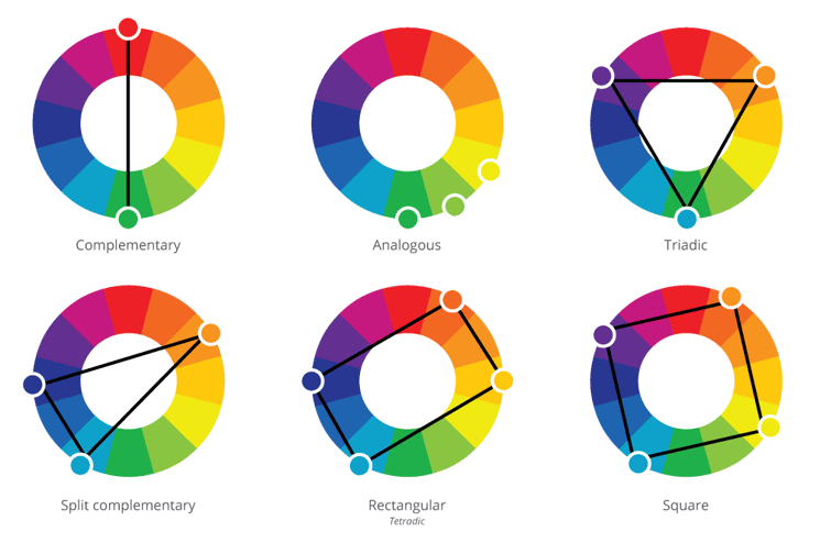
Colour theory wheels.
Be sure to check out accessibility guidelines. Some colour combinations are difficult or impossible for people to read.
In HubSpot, you can perform A/B testing to see which colour performs best.
CTA buttons can incorporate design accents such as beveled edges, rounded corners, drop shadows, gradients or icons. Image CTAs can blend photos, graphics or icons with block colours and button graphics to balance out all of the visual information.
If your CTA looks like a button or clickable image, your visitors will recognise it as a pathway to further information, which will improve your goal conversion.
In terms of sizing, the CTA should be large enough on the page to be noticeable, but small enough that it doesn’t overwhelm the user and come across as spam.
Copy
Next, there’s the copy within your CTA. The language here should be action-oriented. Start your button text with a verb. It should be clear to your visitors what will happen when they click.
Examples include:
- Get my copy
- Talk to us
- Learn more
Outline what visitors will gain by clicking your button. Lead with the benefits to them, not the action you want them to take - 'submit' is not as powerful CTA word choice as 'get eBook' because it doesn't reinforce the offer at hand.
This often works best using an image CTA. In an image, you can lay out a header declaring the offer, followed by sub-header that describes value, and polish it off with an action-oriented button.
Try not to be too verbose with your CTA copy. What's on offer should be clear at a glance - inciting impulse reactions to click and find out more. Online audiences simply don't have the patience to decipher long-winded messages from marketers.
CTA placement
Another thing to consider is CTA distribution. This will be determined by your offer's value and relevance to your customer. You'd do well to consider who would benefit most from your content, and make sure that they come across it at a convenient time.
This means that awareness stage CTAs, like those encouraging people to subscribe to newsletters or blog notifications, are well placed above page folds. This fast-tracks the encounter as they don't have to browse or scroll for very long. This type of call-to-action could also be on main website pages, and introductory content.
The end of a blog post is an ideal place to place consideration stage content. Readers who have shown an interest in your writing are more likely to see value in deeper content.
Leave breathing space around the call-to-action. Clutter will detract from your design. For the same reason, don't bunch CTAs together. One strategic offer is adequate - think quality over quantity. Having too many options can actually be paralysing, even when everything on offer is highly appealing.
This is a bit of a side note, but it's important to make sure your company's privacy policy is clearly visible (on your site footer for example). If people can access your privacy policy easily, and you are transparent about the way you use user data, it boosts the credibility of any offer you make. Build trust by making it clear that you won’t abuse your visitor’s privacy, and you'll also improve the CTR for your content offers.
So, in order to make a CTA that converts make sure you keep strong visual impact, succinct copy-writing and strategic placement front of mind.

